The keynote was held at San Francisco, and while not as big as Macworld keynotes, it was nonetheless a reasonably major event. Steve came on stage to a rousing applause from the audience, and the first issue he addressed immediately was his health. “The reports of my death are greatly exaggerated," said the vegan dressed in his usual black turtle neck top and jeans. Now this is a huge sigh of relief to investors, worried that his supposedly deteriorating health would affect Apple. But anyhow, we're glad to hear that... he looked his usual self.
Then he announced some statistics, the usual stuff that makes people go WOW. There are now 3000 iPhone and iPod touch apps, and iTunes Store is the top music distributor in any format in the US, beating Walmart. Impressive.
Now for the product announcements.
iTunes 8
Jobs started with iTunes 8, the next version of the popular music jukebox software for Mac and PC. He introduced HD TV shows which can be purchased online for USD 2.99, and showed some samples. Great quality, but not exciting to me.
iTunes 8 also has a new way of browsing music, where album artwork are displayed in a grid format so you can see all your albums at one go.
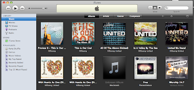
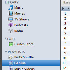
Then comes some really lame stuff IMO: the Genius playlist. What Genius does is to "automatically make playlists from songs in your library which go great together". In other words, this is smart shuffle. It takes random songs of a similar type and genre and pulls them together. Sounds really cool, good way to discover your library, but this is a superficial feature which doesn't impress me too much.
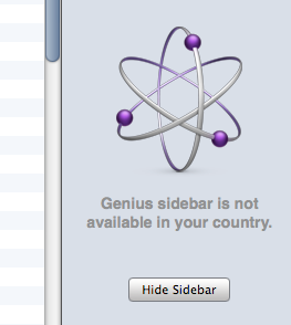
There is also a Genius sidebar, which will fetch recommendations of songs from the iTunes store which goes well with the playlist, and allow you to purchase them. Sadly, this is a not available in Singapore.
And that's about it for iTunes 8. I was expecting something more innovative. -.-
What I think:
iTunes 8 is clearly an evolutionary upgrade, and while some changes are nice, such as the new browsing views, the other features are purely lame and unconvincing, as if they had to force some new feature into iTunes since it's the new version. Genius playlist comes across as being good-to-have, nice to tinker around, but trivial and nonessential. However, the way Apple is marketing this... I think it's overrated. I don't know, you may feel differently, but iTunes 8 is not an impressive update at all.
iPod
With the software side out of the way, Jobs now focuses on the hardware, and this is where things get interesting. As usual, some statistics to brag about how dominant Apple is: iPod has a whopping 73.4% US market share as of July, and more than 160 million iPods have been sold to date. (Interesting fact: Microsoft's Zune player has only 2.6% market share.)
Great job Apple, but I share the same sentiments with Paul Thurrott, that the iPod is now at the point of maturity and changes are getting incremental. The long-term challenge is how to sustain that dominance (and perhaps stub out the up and rising Zune).
iPod classic
This is the most BORING change to the iPod line. The thicker 160GB classic has been phased out, and the only model Apple will offer is a 120GB version at USD 249. No change whatsoever to everything else. Same software, design etc. This is obviously a non-event.
iPod nano
Image from Apple
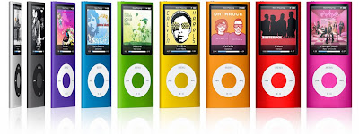
Images of this 4th generation nano leaked out before the event, and they turned out to be dead accurate. Like I tell my friends, this new nano is reminiscent of a popular China fake of the 2nd gen nano! Haha... but whatever, it's so much nicer than the 'fat' 3rd gen nano. Clearly that form factor didn't work out for Apple. When you place all 4 generations of nanos side by side, the 'fat' one totally looks out of place, like it was never meant to be. But that's the past.
The new curved nano, the thinnest iPod ever made, is constructed out of aluminium, and even has curved glass. From an aesthetics standpoint, the curve body is beautiful. From a functionality standpoint, maybe less so. The curved glass could be reflective and cause viewing problems. I haven't had my hands on this thing, so that's just my guess.
The nano also sports an accelerometer, same as the iPhone/iPod touch, adding more functionality to it. When turned on its side, the nano will transit into Cover Flow mode. Photos will also rotate accordingly... neat. Also, when you shake the device, it will change track! But the larger picture is that now fun games on the touch which utilise the accelerometer will slowly make its debut on the nano too. There are also some UI tweaks, one obvious one being how the album art fills the screen like the touch.
The mediocre Genius thingy is also available on the nano, where you can create a Genius playlist right on the device itself, and refresh the playlist for new songs too. The pixel dense 2 inch screen is gorgeous, and the long height allows for nice long menus. Battery life is good, at 1 day for music and 4 hours for video. (Do take these numbers with a pinch of salt, it's normally less.)
The nano is available in 9 wonderfully vibrant colours, and retails for USD 149 for 8GB and USD 199 for 16GB.
What I think:
Apple's got a winner here with the nano. It looks slender and compact, while being durable, and also comes across as funky and hip. Youths would want this player. It has a good form factor and the curved body fits snugly in the hands. But best of all, it's environmentally friendly!
iPod touch
Image from Apple
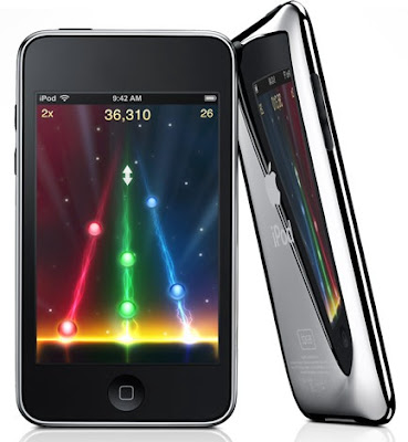
The nano was the climax of the event. After that everything was back to dull and lackluster. There was a new iPod touch, but there's nothing to shout about it. It is much thinner (what's with Apple's obsession for thinness?), and takes on a curved back similar to the iPhone 3G, but still with that awful scratch-able metallic back.
What's really nice is the volume controls and inbuilt speaker, similar to the iPhone, which I feel should have been there since first gen. Jobs reminds us that the speaker is just for "casual listening", but apparently Engadget reports that it's not all that crappy. It would be very useful for playing games, since people do not normally connect the headphones.
Battery life for this device is at 36 hours for music and 6 hours for video (assuming Wi-Fi turned off I suspect). There are also price cuts, though capacities have remained unchanged. 8GB is going for USD 229, 16GB for 299 and 32GB for 399. Very attractive prices indeed...
Lastly, software version 2.1 will run on the new touches. Jobs claims that a ton of bugs have been fixed in this release, backup time reduced, performance improved, and there's a slightly updated UI, which again features the Genius playlists functionality. 2.1 will also be available to iPhone owners, which fixes call dropping and battery life issues. For iPod touch users running 1.x versions, the upgrade to 2.1 will cost USD 9.95, while existing 2.0.x owners can install 2.1 free.
What I think:
iPod touch 2G is clearly evolutionary. It essentially remains unchanged from the first gen, since software can be updated to 2.1. Perhaps the only reason why someone using the first gen touch would upgrade is for the volume controls and speakers! At least, I would. But of course I wouldn't... it wouldn't be worth the money. For the speakers, I already have purchased an external portable speaker that attaches to the iPod via the iPod connector, and for volume controls, you can get the new Apple headphones fitted with volume controls. Problems solved!
So looking at all the announcements as a whole, I'm rather disappointed. It all seems very mediocre (except for the nano) and conservative. But then again, when you are the market leader, and when your products are mature enough, the notion of a total change in the product line is hard to entertain.
Is Apple prepared for the big holiday season? Not really. But will sales be affected? Not really too, simply because they are Apple and the whole world knows iPods.

No comments:
Post a Comment